Data visualisation allows complex relationship between parameters of a dataset to be understood easily and quickly.
The Matplotlib package is a common and convenient Python package for data visualisation. However, let’s take a look at another Python package called Bokeh, as it allows the user to do a bit more.
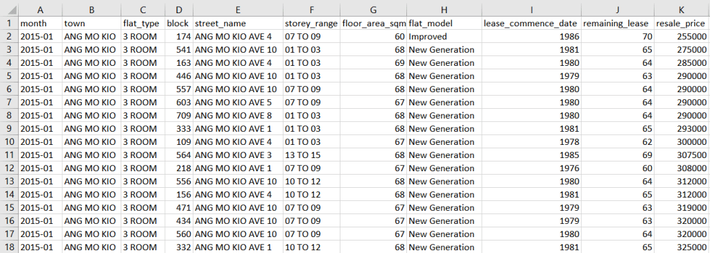
Publicly available HDB resale prices data from Data.gov.sg will be used in the following example. Given the large amount of data available, the date range from Jan 2015 to Dec 2016 will be considered.
The .csv file for this date range has a total of 37153 entries with the following column headings.
Let us consider the block of code below for creating an interactive data visual. The code shown would not start from Line 1 or have continuous Line numbering as with previous post, as some comments/notes present in the code has been omitted for simplicity sake.
We begin with some basic data preparation.
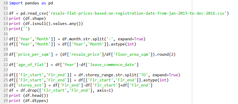
Line 10 imports the Pandas module for data handling. Line 12 reads the .csv file downloaded from the repository as a Pandas dataframe. Line 13 returns the size of the data as (37153 rows, 11 columns). Line 14 returns False, meaning there are no NaN values in the data.
Line 17 splits the information in the ‘month’ column into its ‘Year’ and ‘Month’, and Line 18 converts both their dtypes to integer.
Line 20 creates a new column ‘price_per_sqm’ by dividing the flat’s resale price with its floor area in square metres, followed by rounding the value to two decimal places.
Line 22 creates a new column ‘age_of_flat’ by subtracting the year the flat is sold with the year its lease commenced. It can also be calculated by subtracting the remaining lease from 99 (which is the maximum lease period).
As the storey of the flat sold is provided as a range of 3 stories, the middle value of this range will be taken as an estimated value. Line 24 splits the information in the ‘storey_range’ column using ‘TO’ as the delimiter. Line 25 converts both their dtypes to integer. Line 26 calculates the middle value and save it in a new column ‘storey_est’. Line 27 then removes the two created columns ‘Flr_start’ and ‘Flr_end’ as they are no longer required.

Line 31 returns the number of unique values in the ‘town’ column – which is 26. Line 34 then creates a new DataFrame containing of the list of unique value in the ‘town’ column as follows:
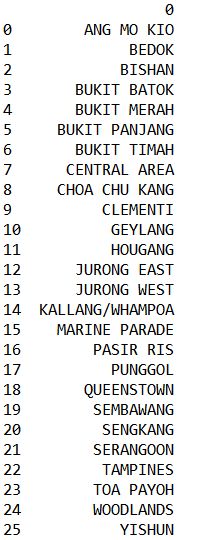
This new DataFrame is more for the purpose of reference.
Line 37 creates a dictionary object with the unique town name as the key, and the corresponding information as the value. This dictionary object will be used later on in the code. If the code such as in Line 38 is called, it will only return the DataFrame of the specified town name, for example.
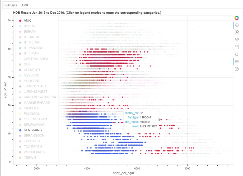
Moving on to the data visualisation, let’s create a plot of the flat’s age versus the price per sqm. Given the rather large number of towns involved, an interactive plot will be used to enable the user to quickly visualise the data between two or more towns.
In the example below, clicking on all the other town names in the legend unselect them, while leaving two towns (AMK and Sengkang) selected. The data points corresponding to these two towns are left highlighted, while the data points of the other towns have been muted to improve clarity. When the mouse is hovered over one of the points, other information corresponding to that data point (e.g. estimated storey, flat type, and flat model) are displayed.
Let’s look at the code for this visual.
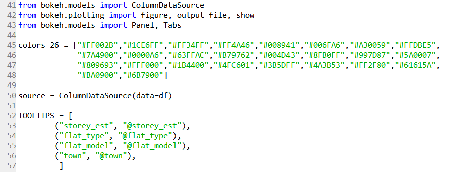
Line 41 to 43 import the functions required from the bokeh package.
Given that there are 26 distinct town name, Line 45 to 48 defines a list of colours as Hex values for the purpose of colour coding, adapted from https://graphicdesign.stackexchange.com/revisions/3815/8.
Line 50 then defines the data source of the plot as the DataFrame that was created and prepared earlier.
The information that we wanted to be displayed when the mouse cursor hovers over a point is listed in Line 52 to 57.
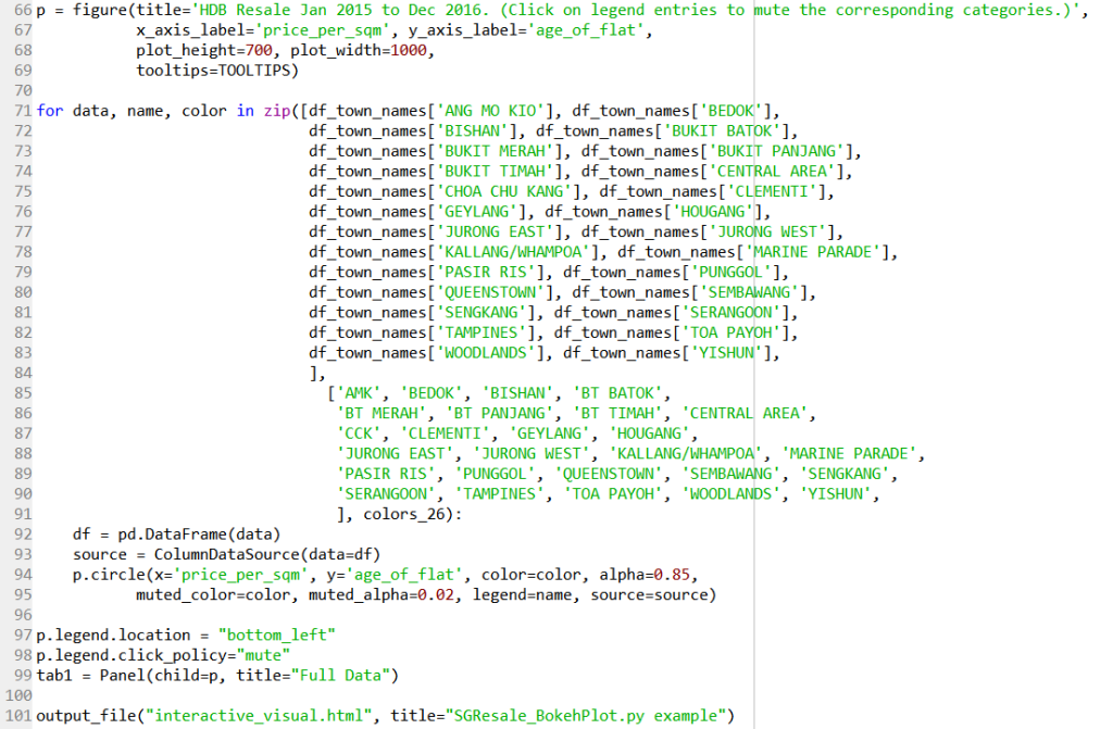
Line 66 to 69 creates the plot using the figure function imported, with the title, axes labels, dimension of the plot, and the tooltips defined in Line 52 to 57.
Using a for loop in Line 71 to 95, each of the town names in the dataset, the DataFrame with only a particular town data is combined with its name label and colour palette. (I am sure there is a better way to code for Line 71 to 90… …) Its source is defined in Line 93 (which is the complete set of data). Line 94 to 95 then creates a scatter plot with the described parameters; a muted parameter is used so that the data points are muted when not selected.
Line 97 positions the legend on the bottom left of the plot. Line 98 defines that the particular series of points are muted when its legend label is clicked.
Line 99 places this particular plot in a tab labelled as “Full Data”, and Line 101 outputs the plot as a .html file.
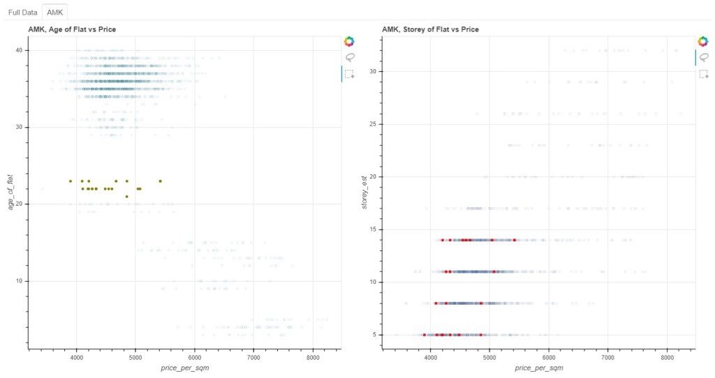
In this example, a tab for one of the towns (AMK) has been created to showcase two plots with linked selections. The plot on the left shows the flat’s age versus the price per sqm as before, while the plot on the right shows the estimated storey versus the price per sqm.
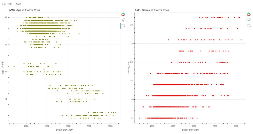
Two selection options (lasso selection and box selection) have been enabled for the plots. These two plots are linked in a sense that when a subset of data points are chosen on the left plot, the corresponding data points on the right plot would be highlighted. All unselected data points will not be coloured with the chosen colours.
Let’s look at the code for this visual.
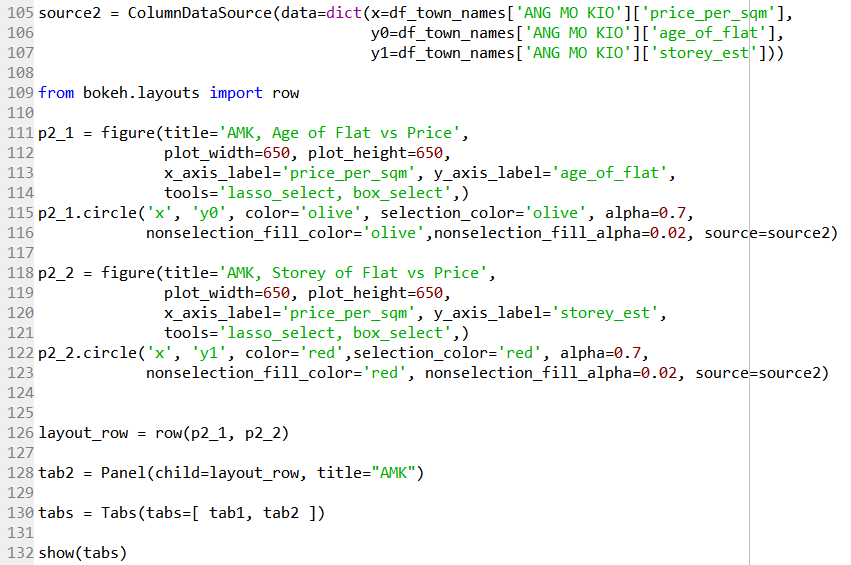
Line 105 to 107 creates another source data to be used with this particular plot; three different column data are to be used.
Line 109 imports the row function that will be used to created a row of two plots as specified in Line 126.
Line 111 to 114 creates the plot using the figure function imported, with the various parameters. Line 115 to 116 then creates a scatter plot with the described parameters. The nonselection_fill_color is specified to give the plot the assigned colour before any selection is made initially.
Line 118 to 123 does the same, but with a different y-axis parameter.
Line 128 then assigns these row of two plots as the second tab.
Finally, Line 130 and Line 132 display all the plots.
One of the advantage of Bokeh is that it allows for interaction by the user, potentially allowing higher order dimensional relationships between parameters to be explored easily, compared to the various static plots Matplotlib or Seaborn has to offer. Nonetheless each of these visualisation packages has its own advantages that could be utilised accordingly.
Is there any way to make the above codes more concise and elegant? Feel free to comment.
